A feature of the covid-19 pandemic has been the relentless highlighting of cases, hospitalisations and deaths of covid-19 with very little context to help interpret the statistics. No matter what the mitigating factors, the story of a deathly and fearful virus is maintained by authorities, media and others protecting the concept of a Covid-catastrophe. This, to our knowledge, has never occurred with any other disease in living memory.
The phenomena has even exaggerated the threat of the virus in the minds of academics and health specialists, who you would expect to remain sober. As an example, Professor Rod Jackson, a professor of epidemiology, in a NZ Herald article published August 18 2020. In the article, he claimed “Learning to live with Covid-19 is not a viable option.”
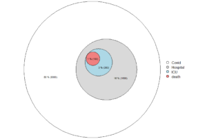
Jackson made several exaggerated claims of the severity of covid-19 that have gone unchallenged for 17 months. He stated that the infection fatality rate of the virus was between 0.5% and 1.5%, or about 1%. He stated that covid-19 is 20 to 40 times worse than the seasonal flu and that one in five infections (20%) would be hospitalised, and that one in five who were hospitalised would require intensive care. That means 4% of hospitalised cases will require intensive care (1/5 * 1/5 = 1/25 = 4%).
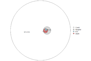
In reality, the proportion of cases requiring hospitalisation in New Zealand, at the time of writing (25/11/2021) is ~57/5213 cases = 1%. This is a 20-fold difference in risk of hospitalisation after testing positive for covid-19, comparing Jackson’s estimate to Ministry of Health reports. Rather than a 4% risk of need for intensive care, the risk is now 7 in intensive care/5,213 current cases = 1.3/1,000 or 0.13%.
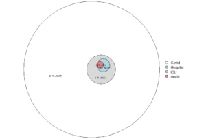
The difference in severity of covid-19 conveyed by Professor Jackson compared to observed data may be displayed in Euler diagrams consisting of concentric circles whose areas represent numbers in each category of severity below (figure 1 for Jackson’s estimates, figure 2 for current government figures and figure 3 for pre-vaccine era figures). In each figure, the area of the outer circle is proportional to the total count of covid cases, the grey indicate those who needed hospital treatment, the light blue intensive care and the red deaths (taken as 1% case-fatality for Professor Jackson, and estimated by using 5,213 current cases * 41 deaths/10,789 cumulative cases in New Zealand (11/November/2021)).
These diagrams demonstrate the distorted perspective portrayed by experts and health authorities, compared to the official reported reality. The difference is stark.

Figure 1. Professor Jackson’s estimated proportions of cases needing hospitalisation, intensive care and who would ultimately die with covid-19 in the New Zealand media, August 2020.
Notional 10,000 cases used for illustration.

Figure 2. Actual severity of covid-19 cases in New Zealand, 25/Nov/2021.
One possible explanation for this discrepancy is that covid-19 cases in New Zealand now are mitigated by the widespread use of the vaccine. However, figure 3 below is based on an earlier description of the epidemiology of New Zealand covid cases from February to May 2020, before the vaccine era. This indicates only 4%, rather than Jackson’s 20% of cases needed treatment in hospital. Reality was already five times lower than Jackson’s figure. The admissions to intensive care were 0.67% of all cases, six times lower than Jackson’s estimate. Also, one can see (figure 2) that the many of the apparent deaths with covid-19 did not qualify for intensive care treatment, due to age and comorbidity. The figures given by Jackson have never been questioned for accuracy or corrected. Jackson also talked of infections rather than ‘cases’, on which the Lancet paper he drew from was based. This means the reality departs even further than Jackson’s depiction indicates.

Figure 3. Severity of covid-19 cases in New Zealand, February to May 2020.
To make sound policy, supported by a well-informed public, health authorities, and the media must convey an accurate sense of the severity of covid-19.
The threat needs to be estimated from true counts, rather than conjured-up figures. The diagrams convey how far reality has been warped.
It is clear now that many predictions, models, estimates and beliefs did not come to pass. The investment in the famed ‘elimination strategy’ is now not worth the paper it was written on. The lack of scrutiny on doomsday predictions has adversely affected our perception of the reality of covid-19 and our collective ability to respond to it appropriately.
We’ve been wondering why this distortion is occurring, and why so few people seem to care. The factor that stands out to us, and that the case of Professor Jackson illustrates, is that no one loses by highlighting the worst and downplaying the best. There are no questions, no re-assessments, and no penalties for being wrong, if you follow and contribute to the story of a deadly virus.
